MEDUSA© Panels
Here you have a detailed explanation about the three main panels of MEDUSA© Platform: plots, log and app panels.
For MEDUSA© Platform v2022
If you have any questions that are beyond the scope of this help file, please feel free to ask for help in the forum or contact with us.
Plots panel
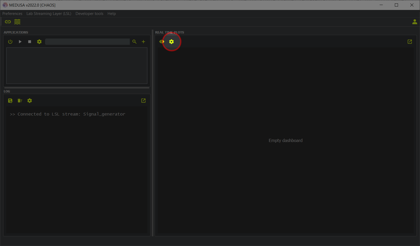
The right part of the MEDUSA© main screen shows the “Real time plots”. There you can view the signals that are being monitored in real time. Different features, such as the shape and number of plots displayed, can be fully customized to suit your needs. Two categories of real-time plots are provided:
- Time plots. This type of graph presents the time courses of one (or more) channels.
- PSD plots. This type of graph shows the power spectral density (PSD) of the signals you are recording in real time. Detailed information on what a PSD is can be found here.
Of course, these graphs have many options to configure, adapting to the requirements of the study. Let's see how to add graphics to the MEDUSA© window and configure them!
Configuring the plot window layout
First of all, you need to consider how many charts you want to create and their size. To do so, the first step is to click the button (remember to set up the LSL signal first!).
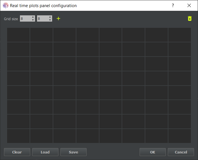
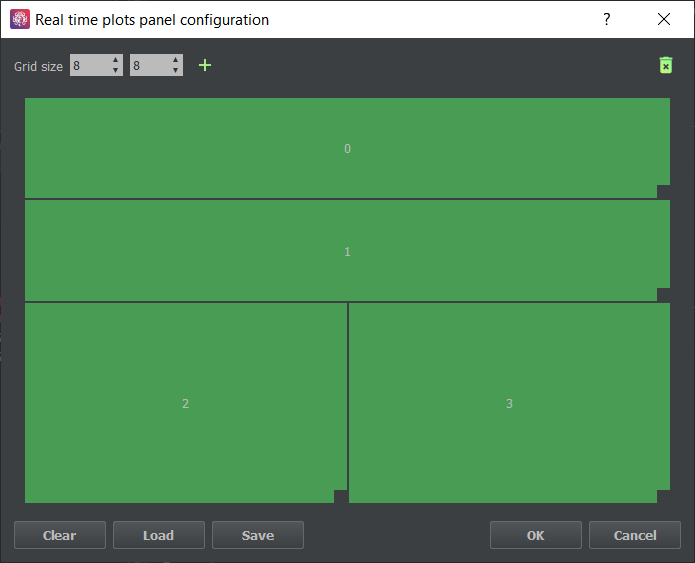
The window below will appear. In the upper left corner, you can set the size of the grid to accommodate different plots. You can also create a new plot by clicking the button. Created parcels can be deleted by dragging them to the icon in the upper right corner. At the bottom of the window, the Clear button would remove all existing charts, Load and Save buttons would restore and save a specific plot layout, OK button would apply the current layout, and Cancel button would discard the changes and close the window.
Now that you know what all the buttons do, let's create some graphs! To do this, click the button. A light gray square will appear indicating the position of the created graph. You can change its position by dragging it on the grid, and the size by clicking and dragging on its bottom right corner. Now create 4 different plots with the layout indicated in the figure below.
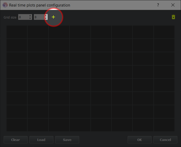
Step 1) Click on the + icon to create a new plot

Step 2)The new plot is displayed in light gray

Step 3) Change the size of the plot

Step 4) Create 3 additional plots to make this ploy layout
Configuring the plot options
Once the plot layout is configured, it is time to configure each of these graphs. This will change the color of the plots to green, indicating that the plot is ready for use. To configure a graph, you must right-click on it to open the configuration window shown below. There, you can choose the source data in the Connect to dropdown, plus you can choose between four different graphs in the Plot type list.
The plots currently provided by MEDUSA© Platform are: TimePlot and TimePlotMultichannel, to represent the time course of the signal from one or more channels, respectively; and PSDPlot and
PSDPlotMultichannel to display the power spectral density of the data from one or more channels, respectively.
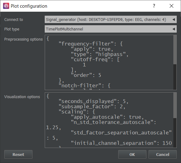
Below the Plot type list, there are two sections where you can complete the configuration of the plot.
On the one hand, in Preprocessing options, different transformations can be applied to the original signal to adapt the representation to your study (e.g., a bandpass filter if you are interested in a certain frequency band).
{
    "frequency-filter": {
        "apply": true,
        "type": "highpass",
        "cutoff-freq": [
            1
        ],
        "order": 5
    },
    "notch-filter": {
        "apply": true,
        "freq": 50,
        "bandwidth": [
            -0.5,
            0.5
        ],
        "order": 5
    }
}
Let's see what this section contains:
-
frequency-filterThis feature allows you to set an infinite impulse response (IIR) filter for online real-time visualization. Settingapplyto true activates the filter. Thetypeoption controls the type of filter (i.e., lowpass, highpass, bandpass and stopband). Thecutoff-freqdefines the frequency limits (e.g., for a bandpass filter between 8 and 13 Hz, we would enter [8, 13]. Finally, definingorderallows you to set the order of the filter (note: higher filter orders increase the computational cost). -
notch-filterGenerally, you want to get rid of power line interference in EEG recordings. This is an alternative way to create notch filters. In this case, instead of defining upper and lower cutoff frequencies, you can define a center frequency in thefreqsection, and relative limits in thebandwidthsection. In this specific case, a notch filter is created between 49.5 and 50.5 Hz. This would be equivalent to setting the filter using thefequency-filtersetting withtypeset to bandstop andcutoff-freqset to [49.5, 50.5].
You may have noticed that all of our visualization filters are IIR. Despite the non-linear phase and the numerical instability they offer, we use IIR filters for online visualization because their order makes them much more computationally efficient than finite impulse response (FIR) ones. For more information on this topic, you can refer to this link.
On the other hand, in the Visualization options section you can customize the plot display parameters.
{
    "init_channel_label": null,
    "seconds_displayed": 5,
    "subsample_factor": 2,
    "scaling": {
        "apply_autoscale": true,
        "n_std_tolerance_autoscale": 1.25,
        "std_factor_separation_autoscale": 5,
        "initial_y_range": [
            -1,
            1
        ]
    },
    "title": "TimePlot",
    "x_axis_label": [
    "Time",
        "s"
    ],
    "y_axis_label": [
        "Signal",
        "V"
    ]
}
The configuration options available for time charts is explained below:
-
init_channel_labelInitial channel displayed in the plot, identified by its label (e.g., 'FZ'). This can be changed once the plot is active by right clicking on it. -
subsample_factorSubsample factor applied to alleviate computational burden. -
seconds_displayedTime range (in seconds) displayed in the visualization window. -
scalingThis allows signals to be automatically scaled for ease of viewing by settingapply_autoscaleto true. Then_std_tolerance_autoscaleparameter controls the autoscale limit (i.e., if the signal exceeds this value, the scale will be re-adjusted), so higher values give less auto-scaling. Also,std_factor_separation_autoscaleindicates the separation between channels (in stardard deviations). Finally,initial_channel_separationandinitial_y_rangeindicate the initial limits of the Y-axis. -
titleAllows to set a title for the plot. -
x_axis_labelYou can set a label for the X-axis with this parameter. -
y_axis_labelYou can set a label for the Y-axis with this parameter.
The configuration options available for PSD charts is explained below:
{
"psd_window_seconds": 5,
"scaling": {
"apply_autoscale": true,
"n_std_tolerance_autoscale": 1.25,
"std_factor_separation_autoscale": 5,
"initial_channel_separation": 0.01
},
"welch_overlap_pct": 25,
"welch_seg_len_pct": 50,
"x_range": [
0.1,
30
],
"y_range": "auto",
"init_channel_label": null,
"title": "PSDPlotMultichannel",
"x_axis_label": [
"Frequency",
"Hz"
],
"y_axis_label": [
"Power",
""
]
}
-
psd_window_secondsTime interval in which the PSD will be estimated. -
welch_seg_len_pctPercentage of the window that will be used to estimate the PSD. -
welch_overlap_pctPercentage of segment overlapping that will be used to estimate the PSD -
x_rangeFrequency limits of the PSD visualization. -
y_rangeLimits for the Y-axis.
The estimation of the PSD is carried out following the Welch method. Click here for further explanation, and here for learning more about the Python implementation.
Visualizing the final layout
Now that you know how to configure the plots, let's arrange the layout (using the default options) as follows:
-
0is theTimePlotMultichannel. -
1is theTimePlot. -
2is thePSDPlotMultichannel. -
3is thePSDPlot.
The plot layout will now be green, as shown in the figure below. It's time to press the OK button and visualize our signals.
After pressing the OK button, you will notice that the charts do not work, but that is ok, just click the button and the visualizations will be activated. Of note, you can
activate and deactivate the visualizations at any time by clicking the button. In addition, you can modify your plots at any time by clicking the button as long as the plots are deactivated.