MEDUSA© Panels
Here you have a detailed explanation about the four main panels of MEDUSA© Platform: real-time plots, log, apps and studies panels.
For MEDUSA© Platform v2025
If you have any questions that are beyond the scope of this help file, please feel free to ask for help in the forum or contact with us.
Real-time plots panel
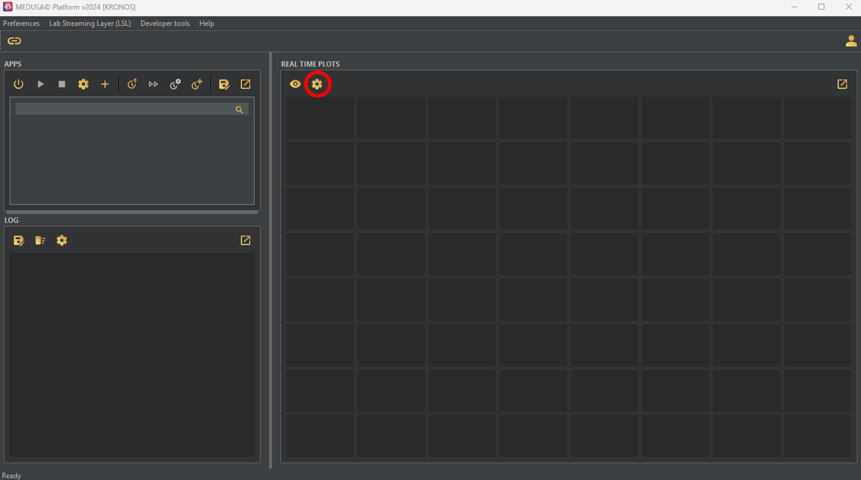
The right side of the MEDUSA© main screen displays the “Real-time plots” section, where you can monitor signals as they are recorded. The display is fully customizable, allowing you to adjust the number of plots, their layout, and other features to fit your needs. MEDUSA© offers four categories of real-time plots:
- Time-Based Plots: Display the time courses of one or more channels.
- Frequency-Based Plots: Show the power spectral density (PSD) of one or more channels.
- Spectrogram-Based Plots: Provide a time-frequency visualization of incoming data, including spectrograms and power distribution.
- Head-Based Plots: Visualize signal activity across channels on a head model, including topographic maps and connectivity metrics.
Each plot type comes with multiple configuration options, allowing you to adapt them to the requirements of your study. Next, let's see how to add plots to the MEDUSA© window and customize them!
Configuring the plot window layout
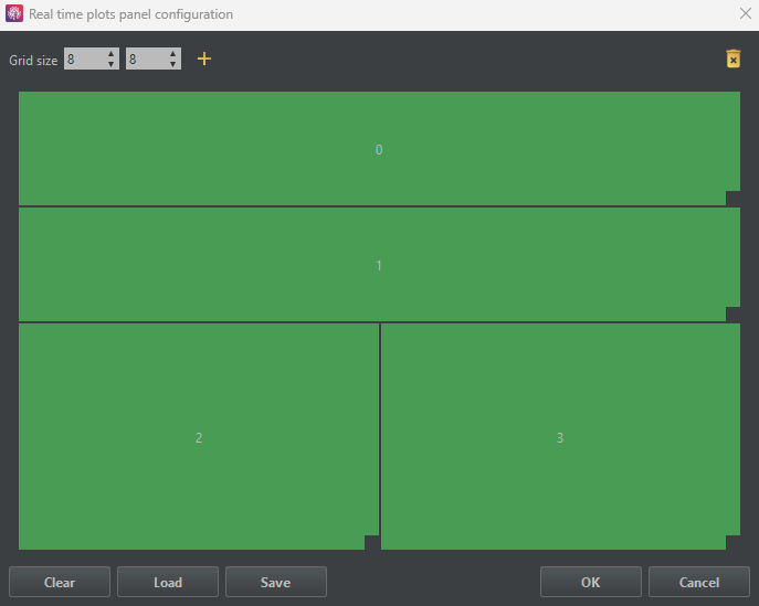
First of all, you need to consider how many charts you want to create and their size. To do so, the first step is to click the button (remember to set up the LSL signal first!).
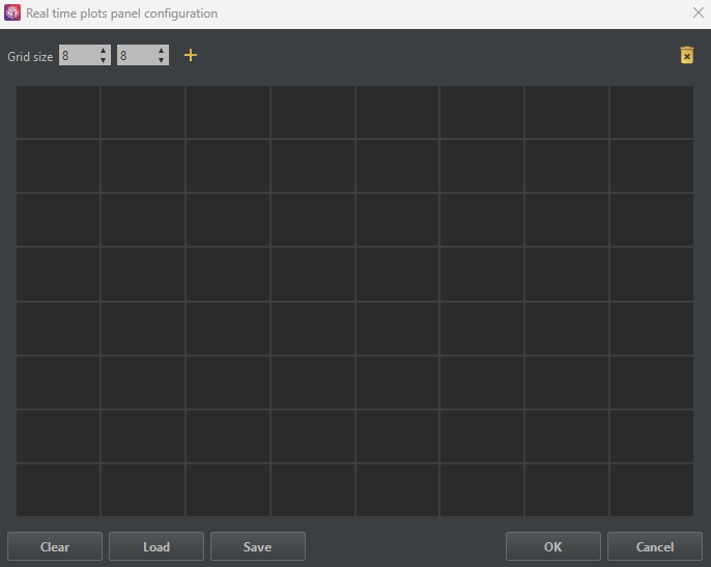
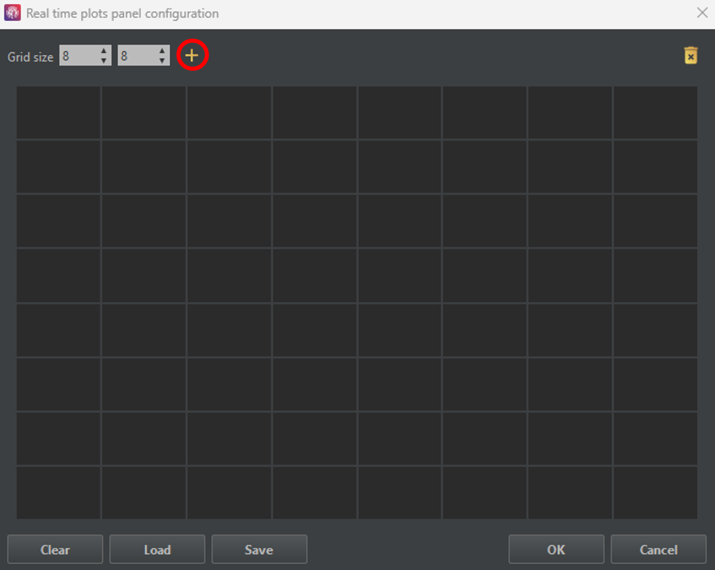
The window below will appear. In the upper left corner, you can set the size of the grid to accommodate different plots.
To create a new plot, click the button in the upper right corner.
Existing plots can be deleted by dragging them to the icon in the upper right corner.
Clicking the button will remove all existing plots.
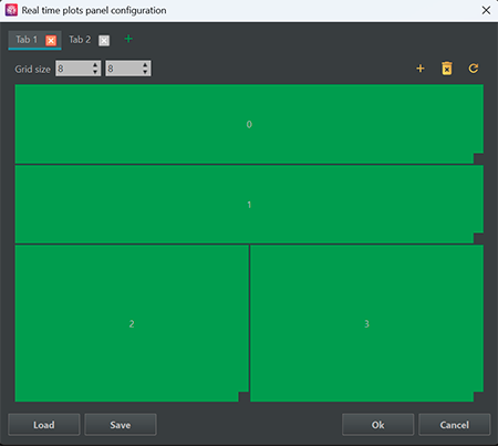
The button in the upper left corner allows you to add new tabs, where additional plots can be added.
Load and Save buttons restore and save a specific plot layout, respectively.
The OK button applies the current layout, while the Cancel button discards changes and closes the window.
Now that you know what all the buttons do, let's create some graphs! To start, click the button in the upper right corner. A light gray square will appear, indicating the position of the newly created graph.
You can move it by dragging it across the grid, and resize it by dragging its bottom-right corner. The figure below shows a step-by-step example.
Step 1) Click on the + icon to create a new plot
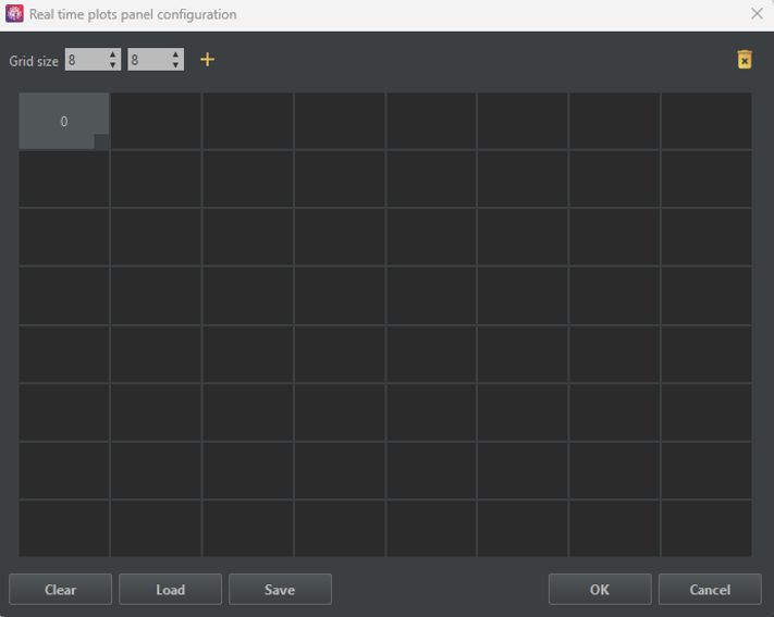
Step 2) The new plot is displayed in light gray
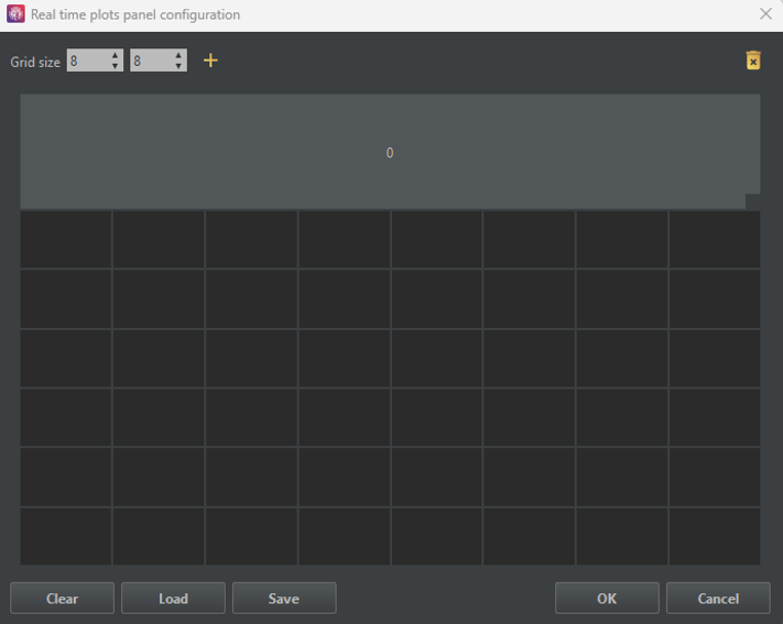
Step 3) Change the size of the plot
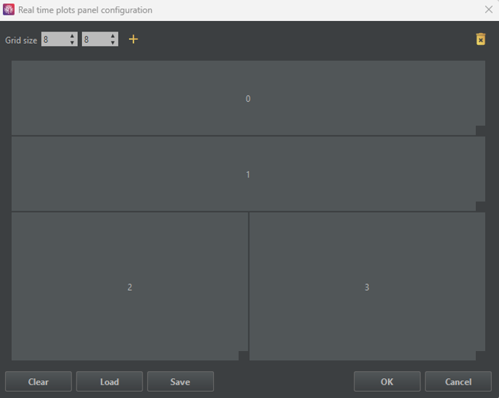
Step 4) Create additional plots
Step 5) Click on the + icon to create a new tab
Step 6) Repeat Steps 1–4 in the new tab.
Configuring the plot options
Once the plot layout is configured, it is time to set up each graph.
Configured plots will turn green, indicating they are ready for use.
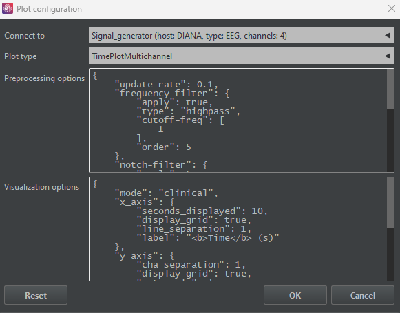
To configure a graph, right-click on it to open the configuration window shown below.
In this window, you can select the source data from the Connect to dropdown,
and choose from eight different options in the Plot type list.
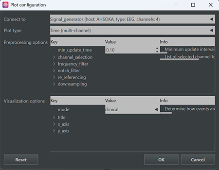
Below the Plot type list, there are two sections where you can complete the configuration of the plot.
On the one hand, in Preprocessing options, different transformations can be applied to the original signal to adapt the representation to your study (e.g., a bandpass filter if you are interested in a certain frequency band).
-
min_update_time: Controls the minimum time interval (in seconds) between plot updates. Lower values result in more frequent updates but increase computational load.If plots are slow, unresponsive, or stop updating, try increasing this value. The optimal setting depends on your computer’s performance and the complexity of the selected plots. -
channel_selection: List of channels considered for visualization. This setting is updated automatically based on the available input streams. -
frequency_filter: Configures an optional IIR filter for real-time visualization. Enable it withapply, select the filtertype, define thecutoff_freq, and adjust theorder. -
notch_filter: Optional notch filter to suppress narrowband interference (e.g., power-line noise). Define a center frequency usingfreqand relative limits usingbandwidth. -
re_referencing: Changes the signal reference. Usecarfor Common Average Reference orchannelto subtract a specific channel from all others. -
downsampling: Reduces the sampling rate of the incoming LSL stream to lower the computational cost of real-time plotting.
All visualization filters are implemented as IIR filters to ensure efficient real-time performance. While IIR filters introduce non-linear phase effects, their lower computational cost makes them well suited for online visualization. For a comparison with FIR filters, see this reference .
On the other hand, the Visualization options section controls the plot's appearence.
-
title: Allows you to configure the plot title. Usetextto define a custom title orautoto generate it automatically, andfontsizeto adjust its size. -
x_axis: Configures the x-axis label, including itstextandfontsize. -
y_axis: Configures the y-axis label, including itstextandfontsize.
Time-based plots display signals along the time axis, allowing you to monitor
how signals evolve in real time. You can view multiple channels simultaneously
with Time (multi-channel) or focus on a single channel with
Time (single-channel).
Specific parameters in the Visualization options of these plots are:
-
x_axis: Includesseconds_displayedto adjust the time range to be shown, andgridsettings for which you can choose whether todisplaythe grid or not, and the separation between lines (step) if applied. -
y_axis: Includes thegridsettings,cha_separationto adjust the spacing between channels, andautoscalesettings for which you can enable automatic scaling (apply) or adjust the scale manually using the mouse wheel. -
mode: This parameter determines how events are presented in the graphics. You can choose between Clinical, where the display grid updates in a sweeping manner, or Geek if you prefer the signal to appear continuously. -
init_channel(only forTime (single-channel)): Selects the channel that is displayed initially. You can also change it interactively by clicking on the plot and selecting a new channel.
Frequency-based plots display the power spectral density (PSD) of the signals, showing
how power is distributed across different frequencies. You can view multiple channels
with PSD (multi-channel) or focus on a single channel with
PSD (single-channel).
Specific parameters in the Preprocessing options of these plots are:
-
psd: Controls the PSD estimation.time_windowsets the time interval over which the PSD is computed,welch_seg_len_pctdefines the segment length as a percentage of the window,welch_overlap_pctsets the overlap between consecutive segments, andlog_powerenables displaying the PSD in dB (10*log10).
The estimation of the PSD is carried out following the Welch method. Click here for further explanation, and here for learning more about the Python implementation.
Specific parameters in the Visualization options of these plots are:
-
x_axis: Includesrangeto set the frequency limits of the PSD, andgridsettings for which you can choose whether todisplaythe grid or not, and the separation between lines (step) if applied. -
y_axis: Includes thegridsettings,cha_separationto adjust the spacing between channels, andautoscalesettings for which you can enable automatic scaling (apply) or adjust the scale manually using the mouse wheel. -
init_channel(only forPSD (single-channel)): Selects the channel that is displayed initially. You can also change it interactively by clicking on the plot and selecting a new channel.
Spectrogram-based plots display the time-frequency representation of the signal, showing how the spectral content evolves over time.
You can view this with Spectrogram or analyze cumulative power across bands with Power Distribution.
Specific parameters in the Preprocessing options of these plots are:
-
spectrogram: Controls the rolling spectrogram computation.time_windowsets the duration of data kept in the buffer,overlap_pctdefines the overlap between segments for the computation,scale_toselects the output scaling (psd or magnitud),smoothenables Gaussian smoothing,smooth_sigmasets the sigma of the Gaussian kernel, andlog_powercontrols whether the spectrogram is displayed in logarithmic scale. -
power_distribution(only forPower Distribution): Defines the frequency bands to be displayed.band_labelsnames the frequency bands, andband_freqssets the corresponding frequency ranges in Hz for each defined band.
Specific parameters in the Visualization options of these plots are:
-
x_axis: Includesseconds_displayedto adjust the time range to be shown, andgridsettings for which you can choose whether todisplaythe grid or not, and the separation between lines (step) if applied. -
y_axis: Includes thegridsettings andrangeto set the limits of the axis. -
z_axis: Controls the color scaling of the plot.cmapsets the colormap,rangesets the limits of the axis, andautoscaleallows you to enable automatic scaling (apply) or adjust the scale manually using the mouse wheel. -
mode: This parameter determines how events are presented in the graphics. You can choose between Clinical, where the display grid updates in a sweeping manner, or Geek if you prefer the signal to appear continuously. -
init_channel(only forTime (single-channel)): Selects the channel that is displayed initially. You can also change it interactively by clicking on the plot and selecting a new channel.
Head-based plots provide a topographical view of the signals recorded across the scalp,
allowing you to visualize spatial distributions and functional connectivity. You can
examine the activity of multiple channels simultaneously on a scalp map with
Topography or explore the interactions between channels with
Connectivity.
Specific parameters in the Preprocessing options of these plots are:
-
power_range: Frequency range used for computation. -
psd(only forTopography): Controls the PSD estimation.time_windowsets the time interval over which the PSD is computed,welch_seg_len_pctdefines the segment length as a percentage of the window,welch_overlap_pctsets the overlap between consecutive segments, andlog_powerenables displaying the PSD in dB (10*log10). -
connectivity(only forConnectivity): Parameters to configure functional connectivity. Includestime_windowin seconds for the estimation andconn_metricto select the connectivity measure. Available metrics are Amplitude Envelope Correlation (aec), Phase-Locking Value (plv), Phase Lag Index (pli), or Weighted Phase Lag Index (wpli).
Specific parameters in the Visualization options of these plots are:
-
head_plot: Group of parameters to configure the head display and channel markers. Includes:channel_standard: EEG electrode montage used to position channels on the scalp.head_radius: Relative radius of the head, controlling the overall size of the scalp representation.head_line_width: Width of lines used to draw the head outline, ears, and nose.head_skin_color: Fill color for the head area.plot_channel_labels: If True, channel labels are displayed on the plot.label_color: Color used for the channel label text.plot_channel_points: If True, markers are drawn at each channel position.channel_radius_size: Determines the size of the channel markers. Setautoto automatically compute the radius, or define a customvaluewhen automatic sizing is disabled.
-
z_axis: Controls the color scaling of the plot.cmapsets the colormap,rangesets the limits of the axis, andautoscaleallows you to enable automatic scaling (apply) or adjust the scale manually using the mouse wheel. -
topography(only forTopography): Settings specific to topographic maps. Includesinterpolateto generate a smooth map between channels,extra_radiusto define additional area beyond the head for interpolation,interp_neighborsto set the number of nearest neighbors used at each grid point,interp_pointsto define the resolution of the interpolation grid, andinterp_contour_widthfor the line width of contour lines drawn over the topographic map. -
connectivity(only forConnectivity): Settings specific to connectivity plots. Includespercentile_th, which controls the threshold for displaying connections; only connections above the specified percentile are shown in the plot.
Visualizing the Final Layout
Now that you know how to configure the plots, let's arrange the layout as follows:
Tab 1
0:Time (multi-channel)1:PSD (single-channel)2:Topography3:Connectivity
Tab 2
0:Spectrogram1:Power Distribution
The plot layout will now be green, as shown in the figure below. It's time to press the OK button and visualize our signals.
After pressing the OK button, you may notice that the charts do not immediately display. That’s okay, simply click the button to activate the visualizations.
You can toggle the visualizations on or off at any time by clicking the same button.
Additionally, you can modify your plots whenever they are deactivated by clicking the button.


Log panel
The left-hand corner of MEDUSA Platform refers to the
log panel. Within this panel, users can see a
chronological record of events that have had an impact on the
platform. These logs not only document the events themselves
but also provide insights into the resulting changes and
consequences that these events have generated.
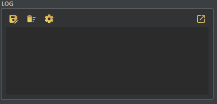
This option enables you to save the text file
generated from the logs into the folder of your choice. It
server as a valuable function for archiving or backing up the
log data in a location that you specify. Clears
the screen where the notifications are generated. It is
particularly useful for maintaining a clutter-free and
distraction- free workspace by removing outdated or redudant
information.Apps panel
A comprehensive list of all the applications included in the platform is displayed in this panel. The apps are listed in order of installation. Detailed information on the necessary configurations of each application can be found in their respective documentation.

In the first block:
The second block, which contains the central icons, focuses on session creation and management. Through this feature, you can create customized sessions that include various applications with different paradigms, each with its own configuration settings.
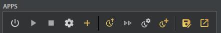
Load session Play session Configure session Create session 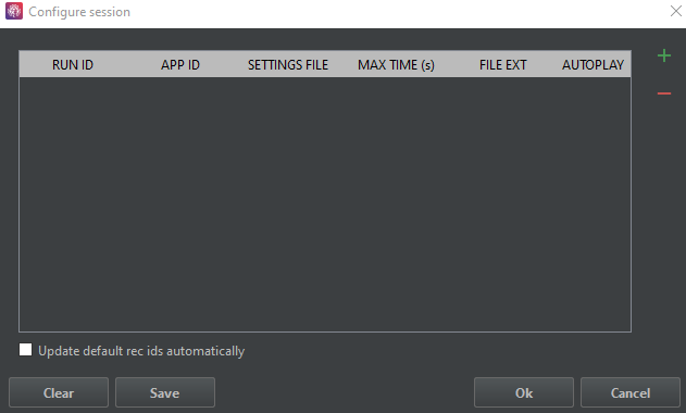
Click on + to add the new parameters.
The parameters to modify:
RUN ID The name assigned to the run. APP ID The identifier of the application to be referenced. A tab will open where you can select the required application (must be installed on your MEDUSA© platform). Settings file Allows to load a previously saved configuration.Max time(s) Define the maximum runtime for the application, particularly beneficial for apps configured to run indefinitely.File ext Extension indicating the type of format of the file (bson, mat or json). Autoplay If enabled, the application will launch automatically after the previous one, bypassing the need for the user to click the play button.
In the Preference tab, there is an option to enable or disable study mode, which enables potential visualization of the desktop folder corresponding to our created session.
Lastly, in Edit recording info![]() you have the opportunity to configure recording details and establish
parameters such as recording ID, file extension and file path. This streamlines the process of saving recordings and allows for the inclusion of supplementary information, such as studio ID,
subject ID, session ID and studio information, enhancing the overall recording experience.
you have the opportunity to configure recording details and establish
parameters such as recording ID, file extension and file path. This streamlines the process of saving recordings and allows for the inclusion of supplementary information, such as studio ID,
subject ID, session ID and studio information, enhancing the overall recording experience.
Studies panel
The "Studies" panel is designed to help manage folders in research projects. It is extremely useful for managing data and recordings in large-scale experiments.
It allows folders to be prepared in advance and automatically saves session recordings in the appropriate directories, reducing human errors, preventing missing files,
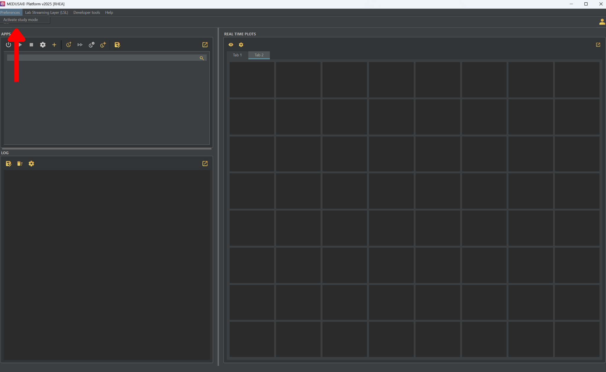
and improving data management and experiment automation. To access this panel, the first step is to enable study mode.
To do so, click on Preferences in the top-left corner of the platform and click on activate study mode.
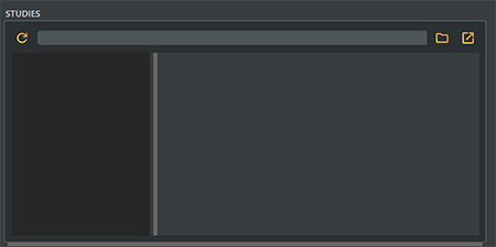
After enabling this mode, the following panel will appear. The first step is to click on and select the root directory of your project.
By default, the selected root directory is the data folder from MEDUSA©. By clicking on , the files in the selected root directory will be updated.
The studies management structure is designed as follows: data → study → user → session. In the following GIF, an example shows how the panel looks using this project structure.
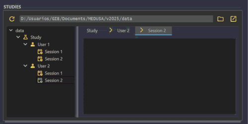
During an experiment, you can select from this panel which user and session will be recorded. All recordings will be saved by default in the selected root directory. Regardless of whether the data → study → user → session hierarchy is strictly followed, the folder selected in the "Studies" panel will always be used as the default directory for saving experiment recordings. Therefore there is no need to follow the proposed struture and any structure is valid.
As shown in the example, if a data file exists at the user level, its contents will be visible directly in the panel, which can help to identify the user more easily.
From the file browser perspective, the structure of the files in the previous example is shown in the following GIF.